


- Home
- Media
- Why Choose Us
- Services
- Influencer Marketing Services
- Non Profit Marketing
- Social Media Monthly Plans
- Social Media One and Done
- Social Media Multi Locations
- Franchise Marketing & Sales
- Web Design & Development
- Email Marketing
- Content Marketing
- Video Creation Services
- Search Engine Optimization
- PPC & Retargeted Ads
- Logo and Print Design
- Conversion Optimization
- Training
- Contact Us
- Terms & Conditions
Marketing Tips for Success
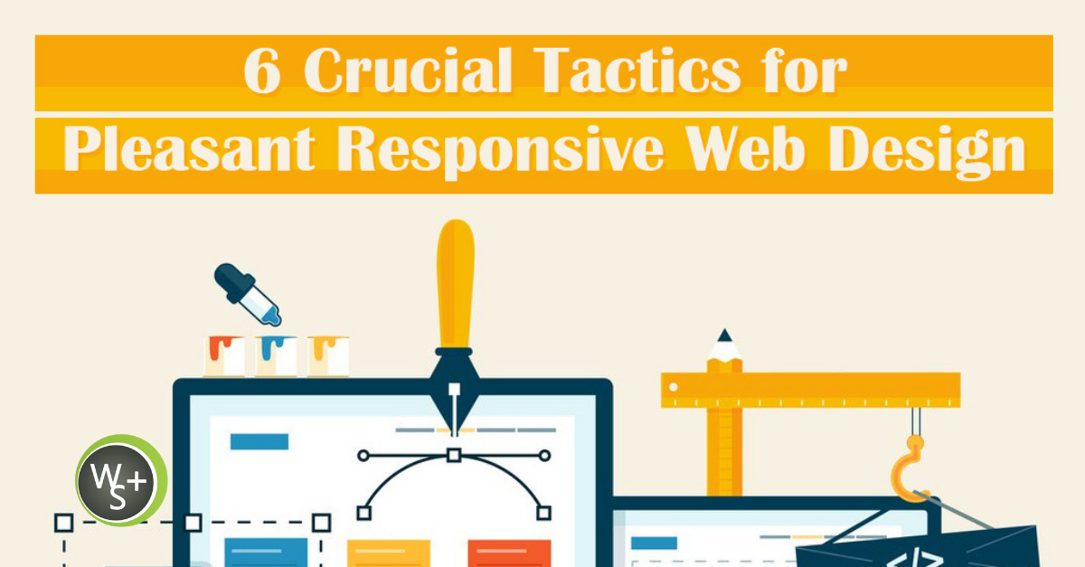
6 Crucial Tactics for Pleasant Responsive Web Design
22 August 2014
By Web Strategy Plus
[post_view]
Responsive web design makes it possible for a website to look and function just as well on a mobile device as it does a desktop computer. Responsive design accomplishes this goal by combining a flexible grid, flexible images, and CSS3 media queries & screen resolutions. The consistency created by responsive design offers the best possible experience to users.
As with any type of web design, it’s important to follow best practices in order to create a great responsive site. Here are the six most important responsive design guidelines to follow:
1. Take a Mobile First Approach
Over the past five years, mobile Internet usage has skyrocketed. While desktops and laptops are still very important, it’s best to begin the design process by focusing on mobile. Not only will this ensure you end up with a smartphone optimized website, but it’s also the most effective way to provide users with the best experience on any device.
2. Sketch Before Designing
How a site’s layout will scale is an important consideration with responsive design. And although it can be challenging to picture this in your mind, the good news is it’s quite easy to pinpoint the right option by sketching. By starting with pen and paper or an online sketching tool, time won’t be wasted writing CSS for a layout that ends up being scrapped.
3. Understand What Content is Most Important
A big advantage of responsive design is it makes it possible to highlight the most important content on a site even when the site is being viewed on a 3.5″ screen. But in order to get the best results from responsive website design, it’s important to clearly identify what content should be displayed first on a smaller screen. This will ensure that visitors’ attention is immediately grabbed so that they will want to continue looking at the site.
4. Be Aware of Breakpoints
This term refers to how content shifts when it’s displayed on screens of certain sizes. While it’s fairly easy to address breakpoints with CSS rules, the important thing is to consider them early in the design process so the addition of those rules isn’t accidentally overlooked.
5. Utilize Adaptive Images
Of all the components of creating a responsive design, this is often the one that ends up being the most challenging. Fortunately, as long as your project is in the hands of an experienced responsive web design services provider, you can be confident that the right strategy will be selected and implemented.
6. Take Advantage of Compression
How fast a page loads is an important consideration for creating a great user experience. It’s also a factor Google looks at to determine their rankings. Since loading speed has a significant impact, compression technologies like GZIP should be utilized to ensure a site loads as quickly as possible on any type of device.
By following these guidelines or working with a company that uses these responsive web design tactics, you can be confident that your new website or redesign will turn out great.
 Could you benefit from a better website marketing strategy? Web Strategy Plus offers a free quote or consultation to help you identify the areas of your marketing plan that need improvement. Learn More
Ready to get started? Schedule a Free Initial Consultation